GiftYa
Doubling session length by fixing what visitors couldn't figure out.

TIMELINE
ROLE
TOOLS
SKILLS
0x
0x
0%
0%
0%
0%
The Problem
The homepage didn't communicate what GiftYa is
GiftYa is a digital gifting platform that lets users send personalized gift cards via text or email. Visitors were landing and leaving in 18 seconds. The page was buried under SEO-driven text walls, outdated early-2010s visuals, and unclear messaging. Most people couldn't figure out what GiftYa was, so they'd leave.
With paid acquisition driving most traffic, every 18-second bounce meant wasted ad spend and lost conversions. The homepage wasn't just unclear, it was expensive.
📝
Too much SEO
Marketing crammed the page with keyword-heavy copy blocks. Walls of text everywhere. Visitors couldn't scan, couldn't find the value prop, and left.
🎨
Outdated visuals
Icons were barely visible. Visuals looked dated. For a fintech product competing with modern apps, this killed trust fast.
📉
Poor content hierarchy
The section explaining the product was placed far down. 80% of visitors never scrolled that far.

Research
Understanding where users were dropping off
I used session recordings and heatmaps to identify friction points and engagement patterns.
Session recordings showed:
80% of visitors dropped off halfway down the page
They never saw "How It Works" or understood the product.
"How It Works" was buried at the bottom, near the footer
Almost no one reached it.Average time on page was 18 seconds
Not enough time to understand the value prop or take action.83% of web traffic came from mobile devices
The old design stacked dense text blocks, making it impossible to scan.
Heatmaps showed:
Heavy interaction with navigation elements, minimal engagement with page content
Visitors were hunting for answers in the nav instead of reading the page.
CTA buttons in the hero were ignored — visitors didn't understand the product enough to click
Without clarity on what GiftYa was, CTAs felt risky.
Competitive analysis: Marketing was obsessed with SEO and wanted walls of text to rank. I pulled up Giftcards.com and Blackhawk Network, direct competitors that both ranked well with clean, minimal copy and modern visuals. I showed them you don't need text walls to win SEO.
The core problem: GiftYa needed to communicate value and build trust within the first few seconds, or visitors would leave.
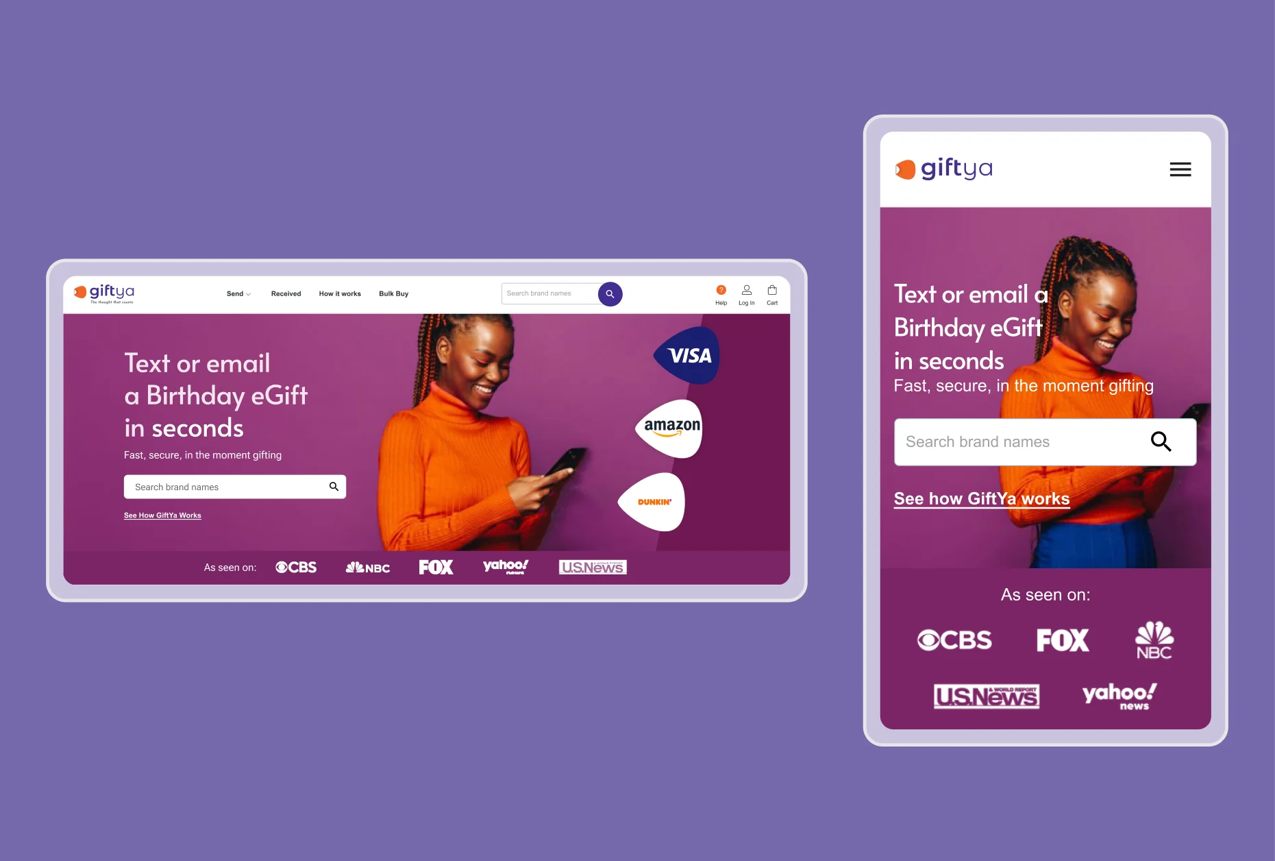
I redesigned the homepage to clarify the value prop in one sentence, modernize the visuals to build trust, and prioritize mobile-first hierarchy — eliminating the confusion that was driving visitors away.
Design Decisions
Clarity, trust, and mobile-first hierarchy
Cut SEO text, lead with clarity
No more walls of text. The hero was rewritten to clearly explain product value in one sentence. Partner logos were added immediately below the hero to build trust, these were previously buried mid-page.Tradeoff: Marketing pushed back hard. They were terrified of losing SEO rankings by cutting text. I showed them competitor Giftcards.com and Blackhawk Network websites. Both are minimal in copy and ranking fine. Competitors weren't winning with text walls. They relented, but wanted to monitor rankings post-launch. Rankings held steady.
Reject "everything above the fold"
'How It Works' was moved higher up on the page. This replaced a generic feature list that heatmaps showed was being ignored anyway.Tradeoff: Execs wanted everything crammed above the fold — value prop, proof, features, 'How It Works,' and CTAs all visible without scrolling. I argued this would create information overload and kill comprehension. Users need room to breathe and move from section to section.

Reorganized content to guide visitors from value prop → proof → features → CTA
Mobile-first for 83% of traffic
The old design stacked dense text blocks on mobile, making it impossible to scan. I shortened copy, increased white space, made CTAs thumb-friendly, and designed every section mobile-first.
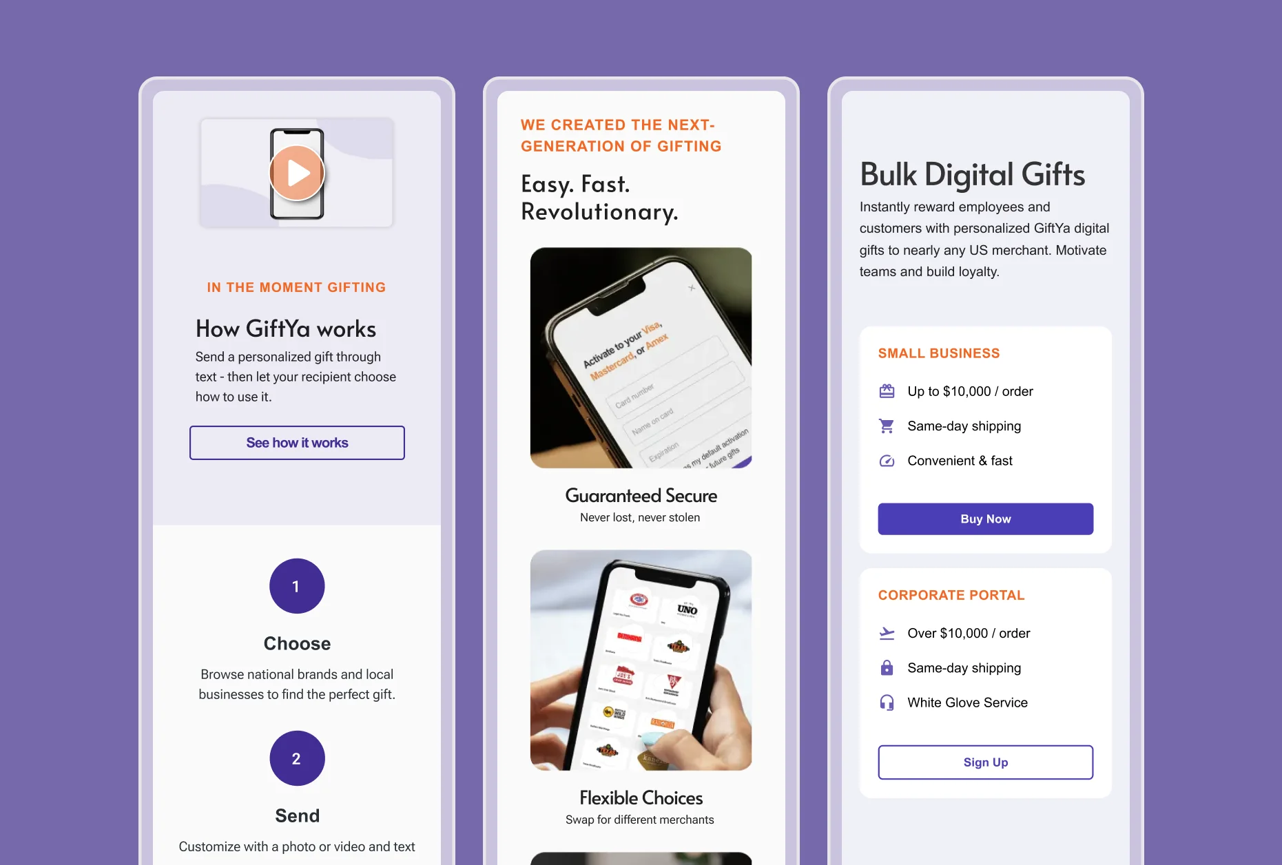
Mobile-first design for 83% of traffic
What I didn't do
Marketing wanted a customer testimonial carousel in the hero section. I pushed back because session recordings showed visitors weren't staying long enough to engage with carousels, and adding one would push 'How It Works' even further down.
We compromised: added testimonials below 'How It Works' instead, where visitors who were already engaged could see them.
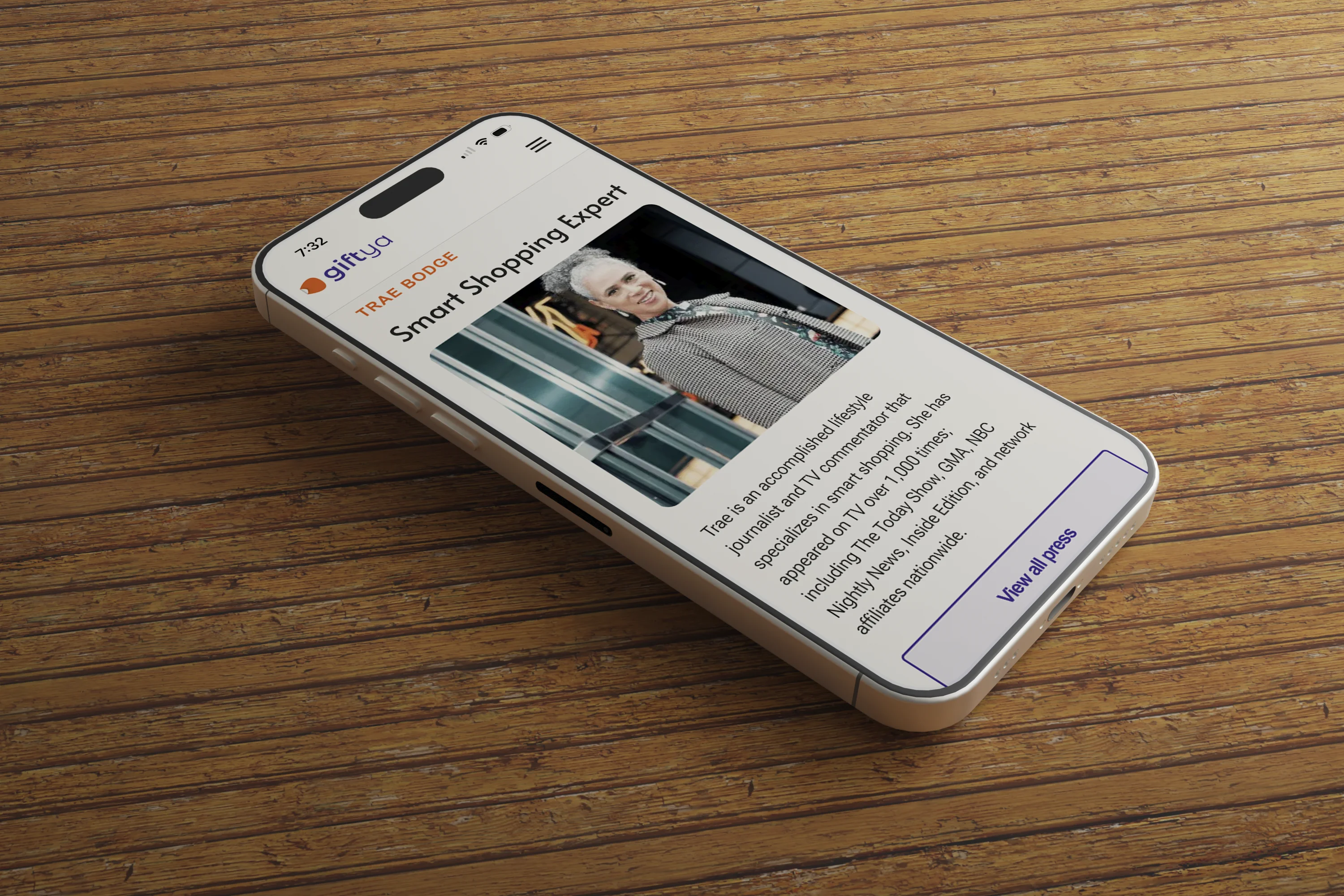
Here's the finished product in the real world
Outcome
Longer sessions, higher trust, more conversions
⏱️
Time on page increased 2x
Average session length went from 18 seconds to 38 seconds. Session recordings 1 week post-launch showed visitors scrolling to the footer and engaging with CTAs.
⛹🏾♂️
Bounce rate dropped 22%
Visitors stayed longer and engaged more deeply with the content. Moving 'How It Works' higher and trimming text walls made the page scannable.
⬆️
4% lift in conversions
Clearer messaging and stronger hierarchy led to more purchases directly from homepage traffic. Revenue tracking post-launch showed a noticeable spike we can attribute to the redesign — translated to an estimated $120K in additional annual revenue.
📈
Higher engagement with "How It Works"
Moving this section higher increased interaction by 5x. Visitors who engaged with "How It Works" were 3x more likely to convert.